As I said in the previous post in this series, the Obama campaign understood the power of social networks so thoroughly that they made social networking technology the foundation of their campaign Web site.
The primary purposes of the Obama campaign site were to 1) market the candidate, 2) raise funds, 3) connect supporters, 4) organize volunteers, and 5) inform voters. How did it perform?
BarackObama.com Graphic Design
The Color Psychology Of BarackObama.com
Graphic design is a crucial aspect of any Web site but especially for political candidates. People judge the credibility of any given Web site based on the graphic design of that site, so you literally have seconds to establish a level of trust with a visitor. A campaign site, therefore, must be professionally designed in order to establish credibility.
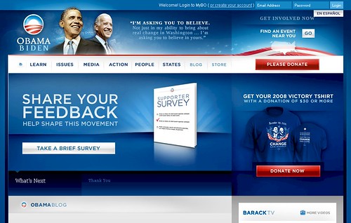
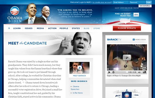
Not surprisingly, Obama’s site accomplishes that goal. While it is entirely predictable that a presidential candidate’s Web site would use a red, white and blue color scheme, the manner in which the color scheme is employed is deliberate and smart.
First, the colors themselves. The predominant color of the site is blue, which is a favorite color of both men and women. Psychologically, the color represents wisdom, trust, loyalty and dedication. The color relaxes the nervous system and can cause people to be more contemplative. Students score higher grades and weightlifters lift heavier weights in blue rooms and people retain more information when reading blue text.
The site, then, is framed in shades of blue with the header and footer of the site designed in nearly all blue. Important information–headlines and navigation links–are also blue. This makes the site easier to use (blue links equals trustworthy links) and makes important information, headlines, easier to retain.
The other primary color is white. The color white evokes light, purity, cleanliness, innocence, virginity and goodness. It is associated with faith, perfection and order. From a practical point of view, text is most easily read on a white background and that is primarily how the color is used on the site. The top navigation bar employs a white background with blue text and any page with a significant amount of text displays that copy on a white background.
The two highlight colors are gray and red.
Gray is a conservative, neutral, and balanced color that does not evoke strong emotions. Though it is a color strongly associated with the elderly, that connection would not be made when used on the young candidate Obama’s Web site. The color is used exclusively on the site as a functional highlight.
The color red, on the other hand, is an intensely passionate color. It is associated with energy, strength, power, determination, leadership, courage, life force (as in blood), passion, desire and love. While its negative associations include alarm, danger, war, rage and anger, the color also enhances the metabolism, increases respiration and raises blood pressure.
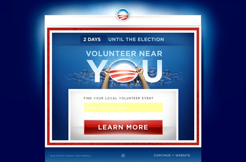
Because of this and because it is an accent color often used to invoke people to make quick decisions, red is used almost exclusively for the most important calls to action, donating and volunteering. The red pops right off the page and focuses the eye because the color is used so selectively.
The design of the site, then, sets the emotional and psychological context within which the campaign can communicate and promotes the very real goals of raising money and volunteers.
Knowing Your Audience
BarackObama.com knows its audiences and serves up content tailored just for them.
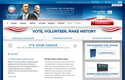
The Issues section, for instance, is designed to give visitors there a nudge. People who are interested in a candidate’s stance on the issues are most likely undecided about whom they’ll support. The issues section, therefore, compares Obama’s position on the major issues to McCain’s stance. Each issue is accompanied by video of Barack Obama laying out his policies for that issue; video is much more persuasive than reading, especially when you consider that each of his points supported and reinforced by cheering crowds.
At the top of the front page of the Issues section, is a block of the page devoted to calls to action for voting and volunteering. The placement of the calls to action is not accidental. People who have a particular issue about which they are passionate are more likely to take action on behalf of that issue.
So assuming the candidate’s position is in line with the site visitors’ views, that person is much more likely to be persuaded to act on such a call to action.
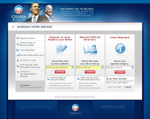
The People section of the web site matches visitors to “people like me”, be that by geography, demographics, or issues. Each page within that section is designed to connect that visitor with other Obama supporters who are like them, get them involved in the campaign in some way, or point them to resources appropriate to that group. For example, the Seniors section includes a link to find early voting locations while the Americans Abroad section includes links to find American Obama supporters around the world as well as a link to request an absentee ballot:
Online Applications
The Overseas Voter Services section is, of course, an example of the Obama campaign’s use of online applications; that is, Web sites that are tools used to perform specific functions. In this case, getting Americans abroad registered to vote and getting absentee ballots into their hands.
The Obama Tax Cut application allowed visitors to see what type of tax relief they’d get from an Obama Administration.
The fundraising component of the Web site, considering Obama’s unprecedented online donations, was obviously a primary application but his fundraising machine deserves a post in and of itself, so I’ll set this one aside for now.
Obama’s Social Organizing Network
As I said at the outset of this post, the Obama campaign so thoroughly understood the power of social networking technologies that they made social networking the foundation of their Web site. And this, too, was an application.
The Obama social network resided at my.barackobama.com and was called My.Bo for short. By registering for the site, users could find and connect with other Obama supporters, especially those in their own neighborhood. It allowed volunteers to organize on-the-ground campaign activities, get out the vote efforts, or online campaigning.
The application harnessed far more volunteer labor than could be done traditionally and did it in a breathtakingly efficient manner. When volunteers reported back to the campaign through the Web site, they added incremental value to the campaign’s voter database.
Obama’s social network provided tools that encouraged involvement in the campaign and established accountability among volunteers.
By empowering volunteers to download and print their own materials, by teaching them how to conduct a virtual phone bank using their own phones, the Obama team essentially crowdsourced their campaign and saved themselves untold dollars in campaign expenses.
The following video demonstrates how My.Bo works:
Microsites
Microsites are independent Web sites that are extremely narrow in focus, designed for a very particular purpose or audience.
The Obama campaign’s use of microsites included their Tax Cut Calculator, their mobile Web site, their voter registration site VoteForChange.com, the anti-McCain site JohnMcCainRecord.com, and the rapid response site FightTheSmears.com.
Search Engine Optimization
The single area in which the Obama campaign performed poorly online is in search engine optimization. Considering how brilliantly conceived the Web site was, it’s odd that search engine optimization wasn’t a consideration.
I can only conclude that the choice was deliberate. There’s certainly a legitimate argument to be made that a presidential candidate of a major party doesn’t have to depend upon search engines for Web site traffic.
That’s entirely true but during election seasons, people perform a lot of searches for political information. They search for candidate information and issue information. By optimizing a candidate’s site for relevant political searches, a campaign can gain valuable visibility within these searches.
Even if searchers don’t end up clicking on a link to the campaign site, the searches themselves are a great branding opportunity.
Finally, search engine optimization can be a rapid response tactic used to get your message out regarding negative and/or breaking news. People frequently turn to search engines for information on breaking news stories.
I’m left scratching my head a bit over the failure to optimize the site because it wouldn’t have taken much effort to do so and no design compromises would need be made.
Nevertheless, despite this minor flaw, the site did everything it set out to do: It raised funds, engaged and connected supporters, informed voters and in doing so, marketed the candidate.
In social media age, Web sites tend to be utilitarian things, places you go to get something, not a destination in and of themselves. They typically don’t offer anything compelling enough to loiter; we hang out at Twitter or Facebook because our peeps are there.
The Obama campaign provided compelling reasons to stay: They created community and offered tools for people to get things done on behalf of the campaign. And by understanding these things, they turned a Web site into the very infrastructure of the campaign itself.
Next, I’ll discuss Barack Obama’s online fundraising machine.
Read also:
The e-Strategy Academy covers all aspects of digital marketing including search optimization & marketing, email marketing, social media marketing, video marketing, mobile marketing & public relations.
