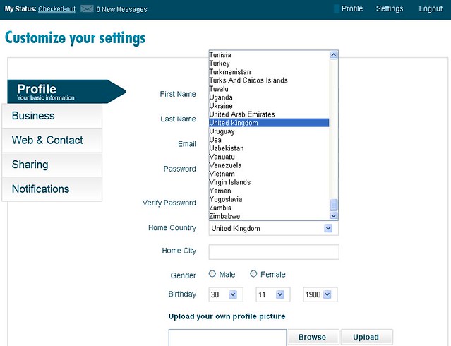
Today, when I signed up with IMGuest, the new hotel-based social networking site for business, I came across the following form when they asked me to customize my profile.
Can you recognize what’s wrong with this form? See if you can find the problem and I’ll tell you what it is after the photo.
Have you spotted it?
I have the United Kingdom highlighted on the country list drop-down but I’m not in the United Kingdom. I’m in the good old U S of A.
I initially hit the U key on my keyboard, thinking my cursor would drop down to the U-s so I could quickly choose United States of America but I couldn’t find it, so I scrolled up to the top of the list since people often put the USA at the top based on the volume of visitors from this country.
No Luck.
I scrolled down the whole list, thinking they might have it listed under America or even North America but didn’t see either of those options so I thought I’d check the U-s again in case I missed it.
I hadn’t…or so I thought.
At the last second I noticed, two choices below the United Kingdom, Usa.
Usa.
I didn’t even see it because it was not in all capital letters, which is the way you normally see it: USA.
It took me WAY too long to find what I was looking for and I nearly gave up.
By missing that tiny little detail, the site designers frustrated this visitor and nearly forced me to abandon giving them more information about me.
Details matter.
The e-Strategy Academy covers all aspects of digital marketing including search optimization & marketing, email marketing, social media marketing, video marketing, mobile marketing & public relations.
