I’ve apparently got web site redesigns on my mind this week.
My first two posts this week were about the NFL.com redesign and now this one. As Kurt Vonnegut would say, So it goes.
It was long past time to overhaul e-strategy.com. This will be the fourth version of the site since I first launched it in December of 1998. The most recent version has been in place since October 2003, so, as I said, it was about time to redesign.
Back in the day, I once got a hair cut that was a completely different style than I’d ever had before. It just wasn’t me. So until my hair grew out enough to restore it to the previous style, I walked around embarrassed and feeling like a dork.
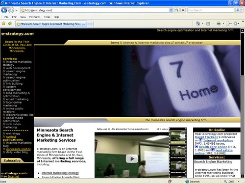
That’s sorta how I have been feeling about the last version of e-strategy.com for a few years but I’ve never gotten around to actually doing the redesigning. It was a fine looking site when it first launched but it was designed before the Firefox browser was released and the only browser you needed to design for was Microsoft’s Internet Explorer (IE). The site, therefore, was designed for Internet Explorer and it looked just fine that way:
But Firefox gained marketshare to the point that I started using it, first for site design purposes, but quickly as my everyday browser. I could see why it was popular. It was fast, it had tabbed browsing, and it had all kinds of add-ons and extensions.
Last month 20% of the visitors to e-strategy.com used the Firefox browser and 29% used a browser that was not Internet Explorer. Internet Explorer still is far and away the most dominant browser, but the percentage of non-IE surfers is too significant to ignore.
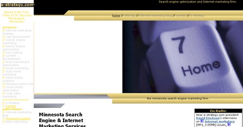
I was so embarrassed by the site because this is how it looked in Firefox:
Ugh. The whole thing was just broken in Firefox.
Redesign Goals
As I said, a redesign was long overdue. I had five goals for the redesign:
- Maintain some of the elements of the old version because I like them
- Ensure the site looks good and works well in IE, Firefox, and the Safari browser
- Avoid using HTML Tables for layout
- Use Cascading Style Sheets for layout and presentation
- Integrate my various Internet outposts into the site
I accomplished my firs two goals. The site maintains some of the look and feel of the previous version and it looks good and works well in all three browsers:
With the exception of the front page, the entire site uses CSS for the layout. Cascading Style Sheets has display quirks between the browsers and for that reason and to save a lot of time, I used tables for layout a little bit on the home page.
From a search engine marketing standpoint, the reason you want to use CSS instead of HTML Tables for layout is that it produces leaner code, and that requires much less work for search engines to read and understand your site. It also allows you to position the most important content where the search engines will read it first.
Finally, it reduces the code-to-text ratio; search engines do not like sites that are heavy on code compared to test as much as they do sites that are lean on code but have plenty of text.
Web 2.0 & Social Networking
The previous version of e-strategy.com was launched before the advent of Web 2.0 and the social network and sharing sites. But now e-strategy has this blog, a MySpace page, a YouTube channel, a Technorati profile, del.icio.us bookmarks, a Twitter blog, and a Flickr account, among others.
I wanted to pull all of those online outposts together to create an e-strategy network and create upstream traffic from each to each, so each site has been built into the navigation system of the site.
These blog posts are automatically updated on the home page via a FeedBurner feed and our YouTube videos are embedded into the site.
I’ll be building the site out a bit in the future and I’ll keep you up to date as I do.
The e-Strategy Academy covers all aspects of digital marketing including search optimization & marketing, email marketing, social media marketing, video marketing, mobile marketing & public relations.


