Posts Tagged ‘Visualization’
LinkedIn Eyetracking Attention Order [HEATMAP]
This EyeTrackShop heatmap illustrates the order of where people focus their attention to LinkedIn profile pages.
Read MoreGoogle+ Eyetracking Attention Order [HEATMAP]
Viewers spent an average of 5.9 seconds in the middle of the Google+ profile page, slightly longer than on either Facebook or LinkedIn.
Read MoreGlobal Big Data Analytics Capabilities, 2012 [CHART]
Nearly nine in 10 companies said they were using transactional data, and three-quarters were collecting log data.
Read MoreRacist Tweets [MAP]
During the day after the 2012 presidential election Floating Sheep took note of a spike in hate speech on Twitter referring to President Obama’s re-election.
Read MoreThe World's Friendships Visualized Through Facebook [VIDEO]
An interactive map visualizes Facebook data illustrating the ties between nations based on the Facebook network connections of their respective citizens.
Read MoreBig Data: O'Reilly Strata Conference
The O’Reilly Strata Conference Strata brings together big data decision makers, managers, and data practitioners for training, discussions, events & exhibits.
Read MoreTwitter Visualization Of SOPA Protest
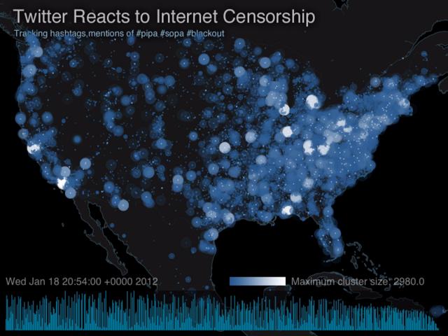
Andrei Taraschuk and Aaron Ott created this visualization of how people reacted the Internet blackouts on January 18th protesting SOPA and PIPA legislation by mapping the #pipa #sopa and #blackout hashtags.
Read MoreMartin Luther King Jr.'s I Have A Dream Speech, Visualized
Nancy Duarte analyzes Dr. Martin Luther King Jr.’s famous I Have A Dream speech.
Read MoreUnderstanding The World Through Video Games
PBS explores video games’ role in our society.
Read MoreGoogle+ Ripples
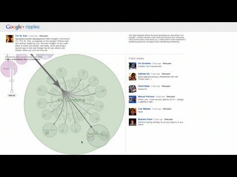
Google recently unveiled a visualization tool for Google+ that illustrates how a given post spreads within the social network.
Read More


