Technographics
Preferences For Subscription vs. Ad-Supported Streaming Content By Device, November 2012 [CHART]

Most consumers still prefer free, ad-supported content though those with connected TVs are more likely to like the ad-free subscription model.
Read MoreThe Economic Impact Of Mapping [INFOGRAPHIC]
Google put together this infographic to illustrate some examples of the benefits of maps.
Read MoreConnected TV & Mobile Penetration, 2011-2016 [CHART]
Smart phone penetration in the world’s top 19 digital markets is expected to double from 35.5% last year to an average of 71.7% in 2015.
Read MoreMobile Purchases By Device, February 2013 [CHART]
More than 6 in 10 smartphone and tablet owners have purchased download media such as ringtones, e-books, and games via their device.
Read MoreFinancial Activities On Mobile Devices By Device Type, February 2013 [CHART]
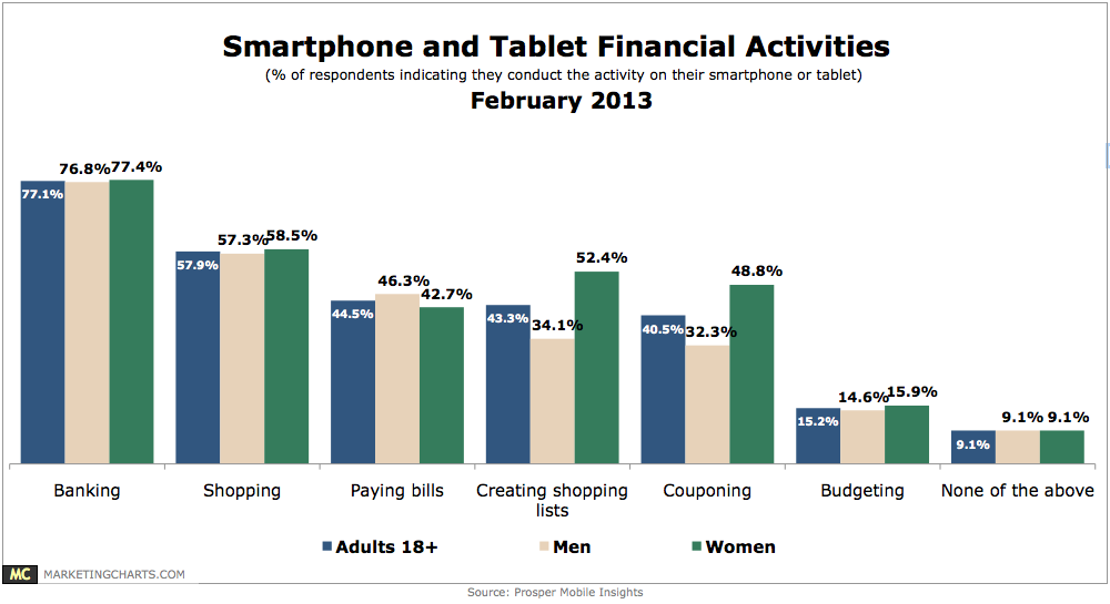
Slightly more than 9 in 10 smart phone and tablet users engage in one or more of a variety of financial activities on their devices.
Read MoreOnline Videos Views By Device, Q4 2011 – Q4 2012 [CHART]
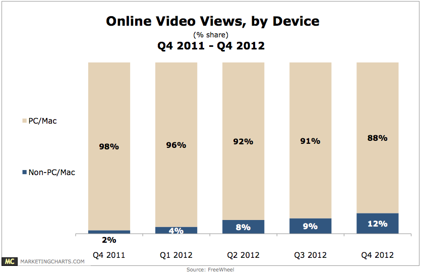
In Q4 2012, non-PC/Mac devices accounted for 12% of video views, triple their share from Q1, and 6 times their share from a year earlier.
Read MoreAmerican iPad Users & Penetration, 2011-2016 [TABLE]
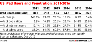
This year, eMarketer estimates there will be 65.7 million iPad users in the US, representing 60% of the total tablet audience.
Read MoreFrequency Of Email Use On iPads, H2 2012 [CHART]
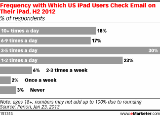
88% of iPad users checked their email on their tablet daily.
Read MoreiPad Users Preferred Email Device, H2 2012 [CHART]
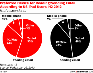
For reading emails, more than half of respondents chose the tablet as their preferred device, beating out PCs and Macs by over 20 percentage points.
Read MoreTop Desired Car Technologies, October 2011 [CHART]
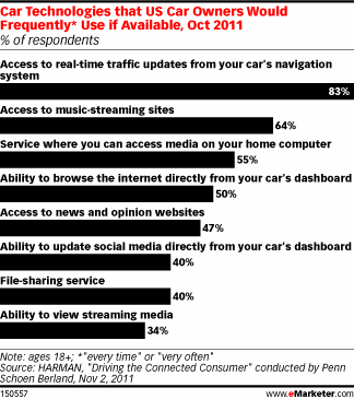
Use of smart phone apps for services like Pandora or Spotify for in-car music listening has shown rapid growth, rising from 6% of US mobile phone owners in 2010 to 17% in 2012.
Read More