Posts Tagged ‘Visualization’
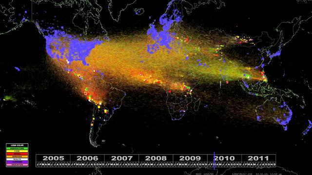
Five Years Of International Microfinance Visualized
What happens when 620,000 lenders fund 615,000 entrepreneurs, students, and other microfinance borrowers around the world? This is five plus years of Kiva loan activity, animated in full color.
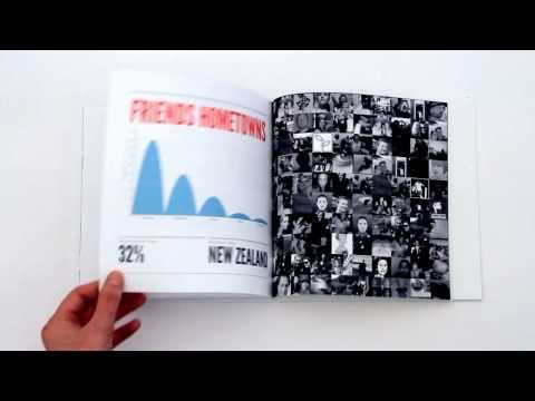
Read MoreFace Book Yourself
A Facebook app will create a book out of your Facebook activity.
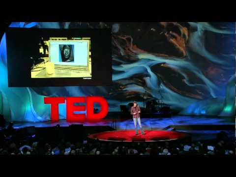
Read MoreThe Data Visual Arts
Artist Aaron Koblin takes vast amounts of data, and at times vast numbers of people, and weaves them into stunning visualizations.
Read MoreWorld History Visualized Through Wikipedia
Gareth Lloyd & Tom Martin cross referenced Wikipedia articles about events & their coordinate to create a visualization of Wikipedia’s view of world history.
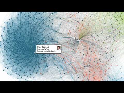
Read MoreLinkedIn's Visualization Tool
LinkedIn’s new Maps tool creates a very cool visualization of your LinkedIn network.
Read MoreThe Beauty Of Data Visualization by David McCandless
David McCandless turns complex data sets (like worldwide military spending, media buzz, Facebook status updates) into beautiful, simple diagrams that tease out unseen patterns and connections. Good design, he suggests, is the best way to navigate information glut — and it may just change the way we see the world.
Read MoreWordcloud: Tim Pawlenty's 2010 State Of The State Address
A wordcloud of Minnesota Governor Tim Pawlenty’s 2010 State of the State speech.
Read MoreChart Wars: Data Visualization As A Messaging Vehicle
Alex Lundy explains the power of data visualization in public discourse.
Read MoreHow The Brain Creates Meaning
Information designer Tom Wujec talks through three areas of the brain that help us understand words, images, feelings, connections.
Read MoreThe One Big Thing: Federal Government Spending Data Mashups
The One Big Thing you need to know this week is that federal government agencies and politicians are beginning to mashup spending data to help the public visualize how that money is spent.
Read More


